This is less of a review and more of a rant; why has £260 million been spent on renovation and a new extension for the Tate Modern that is fundamentally boring and unoriginal?
The new “Switch House.” Image from the Guardian
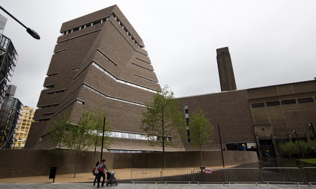
The exterior to the new building might be mildly interesting form the outside (although the tapered design means the land hasn’t been well utilised especially given the price of being by the Thames). The design clearly focused on the outside as inside white box rooms had been arranged removing any of the interesting shapes or lines that could be found on the outside. The notable exception being a sweeping staircase, which isn’t dissimilar to one at the Wellcome. The cafe and members room were generic cafe, ironed of personality, and again disappointing me, I was expecting cutting edge design. The outside was clearly more important here too as you couldn’t see out of the windows in these spaces as they were small and high up, and as contrast the chairs and tables were very low, and also very uncomfortable. This perhaps isn’t the Tate’s fault, apparently uncomfortable, very deep chairs are in fashion. I’m not sure why as you either have to perch on the edge to drink your coffee, or look very undignified as you lie back at a funny angle making your crotch more prominent than it needs to be. As well as the visual problems the acoustics weren’t great in any of the spaces and my Dad who is partially deaf struggled to hear me a lot of the time.
The galleries inside were white and beyond uninspiring, there was nothing ‘modern’ about them. The art blended into the walls (not in an interesting ‘I’m making a statement’ kind of way, more a generic waiting-room kind of way). The labels were hard to find as didn’t say very much when you did find them, and the majority of the art, photographs and sculpture the Tate had chosen to display were either uninteresting, or perhaps more likely, presented in such a white space that they became uninteresting as your senses were numbed by it all.
The basement space called “the Tanks” had potential to be interesting, with the current trend for industrial and exposed concrete, although most of it looked grubby and unfinished. This space is meant to be dedicated to interactive and performance art but as I visited on a Tuesday so nothing was happening and none of the interactive art or things that involved the artist were moving. I usually hate video art but this was one time where I really could have done with a video showing the space and the art as it was meant to be viewed seeing as I couldn’t go back on a Saturday for the scheduled performances.
The only really good thing about the new Tate Modern extension is the view from the viewing deck on the 10th floor, which is excellent. The sign asking you not to nosey into the million-pound-entirely-glass flats next door was a complete waste of space though. Good luck getting anyone to pay attention to that notice.

A view from the top on a cloud Tuesday
Image Reference
https://www.theguardian.com/commentisfree/2016/jun/16/tate-modern-building-great-dont-assume-art-is

Leave a comment